Not Tom. Tom just reminds me of better times when MySpace was first started free from Deep State.
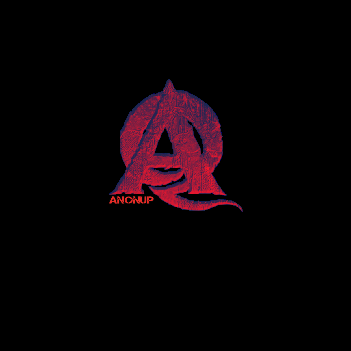
Not so great on graphic design. If anyone has any ideas for a logo I am open.
In response Toni Frankenfield to her Publication
👊Good start. Needs some contrast. And due to our "dark to light" movement, the logo should be brighter. Intertwine Q and A more. And maybe put AnonUp in the middle of the A crossbar. Maybe Red/gold or red/white with blue text. The Q could have stars. The A could have stripes. Sorry, but I've been designing for years and had to give feedback.
Constructive feedback.

